Posts

Business Cards

Image
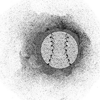
  The reason I chose these schemes was back in high school I was the advertisement committee for events. I made cards like these often and why not put my favorite sport. Baseball has always been a passion to me and no wonder I stamp it in everything everywhere I go! 

Final Portfolio

Image
This is my portfolio of all my work that I have accumulated throughout the whole semester. In the beginning I struggled with how to work the computer script but slowly worked hard to make good content. this class took hours to complete each assignment which in the long run which i am happy with that. it made me into a hard working student using a whole new system that i was unfamiliar with. now that i have picked these skills in this field i hope to keep exercising them and increasing to one day mastery. this will be a class i will tell my kids about one day for how much it changed my viewpoint on technology.

Autoscopy

Image
      For this project, I wanted to show how intricate my thoughts are while simultaneously appearing normal to the outside world. To do this, I took inspiration from the movie the Matrix, and wanted to incorporate the green lines of code into myself. In order to do this, I first cut out the background of myself, and then I overlayed half of myself with green lines, and then using the polygonal lasso, I selected half of myself, and once this was done I inverted the selection, and used the black brush tool, and placed this layer on top of myself to get rid of the lines on the background. After this, I used two layers of this, one with the hue blend mode and another with the linear dodge blend mode. The hue mode made was used to make half of my body black and white, while the linear dodge was used to increase the brightness and saturation of the lines on half of my body. After this, to link the image to the matrix more, I added the lines of code to my body, and used the difference blendi

Tagbrush

Image
       With this tag brush project, I started with the tag brush file that was uploaded by Professor Roundtree. After I downloaded this file, I incorporated the logo that I had previously created, and created separate layers for each of these files. Once I added both together on Photoshop, I blended the edges of my original logo with the tag brush file. I chose to do this because of activities that I was a part of when I was younger. At my school growing up, my class was able to create designs and have them put on cups and mugs. I took inspiration from that and wanted to make a design similar, and this tag brush default shared the same characteristics. Once I combined all of these aspects, this was my final result.

calligram

Image
  For this calligram, I chose to make the message behind it both simple and representative of myself. In order to do this, I wanted to use a simplistic styled shape while using text that is personal to myself. As someone who is relatively easy going, I thought this was perfect was to represent myself and what I believe in.

somewhere

Image
            I chose to use this photo of Juice WRLD from his music video Lucid Dreams for my somewhere project because he is my favorite artist and music is very important in my life. To create this, I first went to his music video and took a screenshot of the scene that I wanted to insert myself into. Once this was done, I asked my girlfriend to take a picture of me with lighting most similar to the lighting in the picture. After this, I used the polygonal lasso to create a layer mask of my face and shoulders. I also used the polygonal lasso to copy the hole in the ground and place it on the right side of the image. After this was completed, I placed the layer mask of the hole on top of the layer mask of myself, and used the eraser tool to get rid of the areas that went over the mask of the hole. After this was completed, I altered the lightness of my face and the hue slightly to math the photo as accurately as I could, and then used the brush tool with low hardness on black around th

Propaganda

Image
  The reason why I chose to put a mask in my face was because this whole pandemic. We have had to change our lives over the last two years and this was my way of expressing my opinion. To create this, I started by uploading a picture of myself into Adobe Illustrator. Once this was done, I began to use the pen tool to trace my face, then used the anchor point to bend it and fit the curvature. Once this was done, I added my facial features, and placed a background layer behind all of this once my face was completed. After this, I disabled the background layer and used the ink dropper tool to properly match my skin tones and hair color as well as my eye colors. Once all of this was completed, I added the designs to the background and added the text on top, and finished by creating the outlines for the text. At some point we need to normalize no masks and I hope my art work portrays how I feel.